UX Best Practices for Your Form Design
Best Practices for Optimizing Complex Forms
No matter how much thought goes into an online web form, it’s only a success if users complete it. It’s that simple. Since each form field requires consideration and action, a person may get distracted or impatient before completing it. Submissions are, therefore, a measure of users’ willingness to carry out the entire fill-out process. Of course, there are things you can do to extend users’ patience. Let’s take a look.
1. First things first: the title
Give the form page a headline, and be sure it expresses the benefit of the form. Instead of “Sweepstakes Form,” try “Enter to Win a Getaway for Two.” Whether it’s a new account, a job application, or a basic email form, the headline helps keep users’ eyes on the prize.

2. Get to know your tools.
Learn as much as you can about and test out form builder features. Check out the different types of form fields and learn about platform functionalities. Using the right features in the right places will encourage as many submissions as possible.
3. Group the fields.
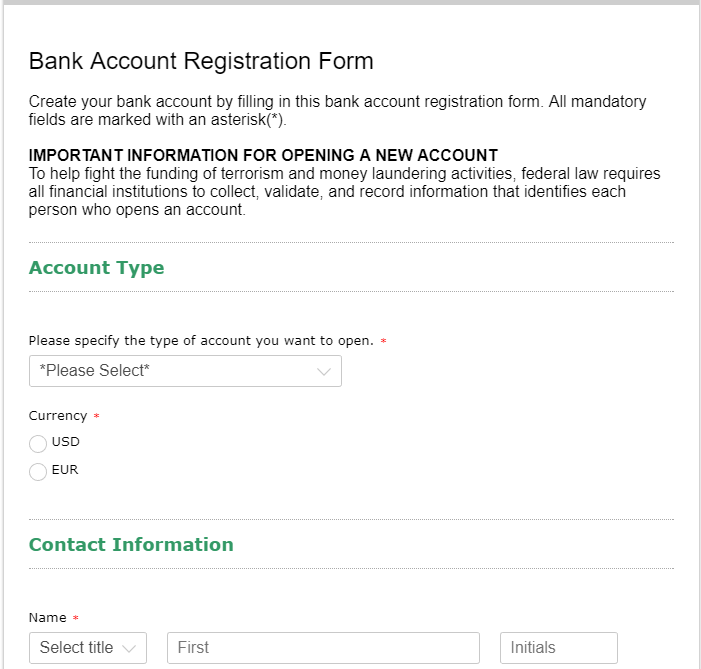
Signal sections either by headings (Personal information, Contact Data, etc.) or by visual elements (thin horizontal lines). Dividing the web form into chunks makes it easier to read and less daunting. Keep in mind that the best conversion rates come with forms that do not require content grouping, i.e. short forms.
4. Consider label positioning.
Field labels can be positioned above a field or to its left or right. Each choice has its pros and cons. Top-aligned labels help users scan and understand the form quickly, but take up more vertical space. Left-aligned labels save space, but may sometimes be too distanced from input areas. They can also sacrifice the alignment of fields. Right-aligned labels also care for the economy of space and, in addition, are easily associated with input areas; however, with right-aligned labels, longer forms are more difficult to scan and may be perceived as less aesthetic. Read more about field labels in short contact forms.
5. Spare as much typing as possible.
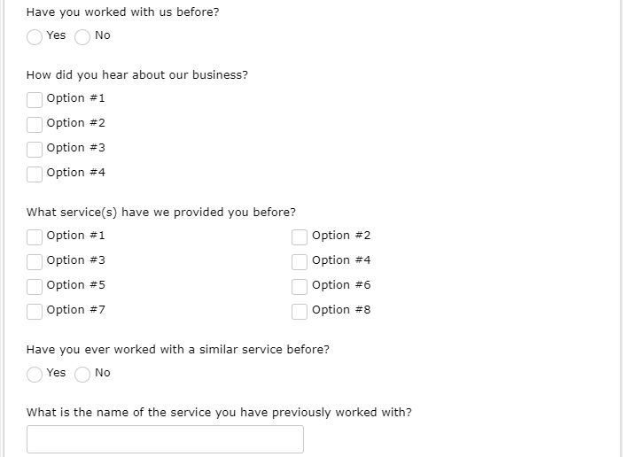
Go for choices rather than freeform text whenever possible: dropdown lists, single choice fields, multiple-choice fields. Tick the Accept other values option to allow users to specify a different value than the ones provided.
6. Add interactivity.
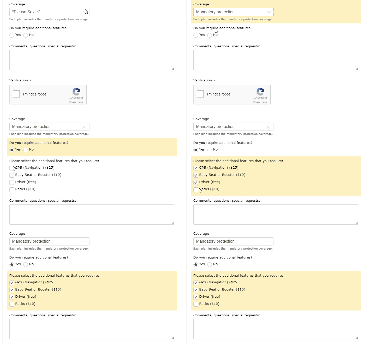
Forms can be responsive to users’ input throughout the fill-out process. Establish field rules for your form and, based on user input, previously hidden fields will show up. This helps the form look easier when the user first encounters it. Why ask for the pet’s name if the user has already stated that he or she does not have a pet?
7. Required vs. optional fields.
For highest completion rates, follow a well-defined objective throughout the form creation process. Most – if not all – of your form fields should be required. If a field is truly optional, consider eliminating it completely. Why should users fill out the information that is not really necessary? In 123FormBuilder web forms, required fields are marked by a red asterisk. If you decide to use optional fields, you can include optional in their labels.
8. Give design its due.
Users take an 8 to 10 seconds—tops—to decide whether they will start filling out your form or not. Layout and design factor into this decision. Try to stick to one-column forms, when possible – it makes it easier for users to focus on one field at a time. Use colors to reflect the form owner’s identity, but limit the hues to two. Avoid field or graphic clutter.
9. Use smart CAPTCHAs.
CAPTCHA images are short verification codes that users have to read and type in order to prove that they are people and not robots. Such images make your forms safer, but annoy users. You can choose to always show a CAPTCHA image at the end of your form or to never show one. The best approach is to use smart CAPTCHAs. These don’t interrupt typical sessions because they show up only when your form seems to be abused (e.g.: multiple submissions from the same IP). Verification number settings can be changed in your Settings → Security section.
123FormBuilder supports reCAPTCHA, an easy verification mechanism that helps Google digitize books and add detail to maps.
10. Provide guidance.
There are several ways in which guidance can be provided to users:
a) Use predefined fields – they eliminate the guesswork;
b) Add field instructions and hint text when necessary;
c) Show highlighted error messages with explanations.
123FormBuilder web forms, when there’s invalid or missing input, an error box is displayed at form top and the field where the error occurred is also highlighted.
11. Don’t forget your mobile visitors!
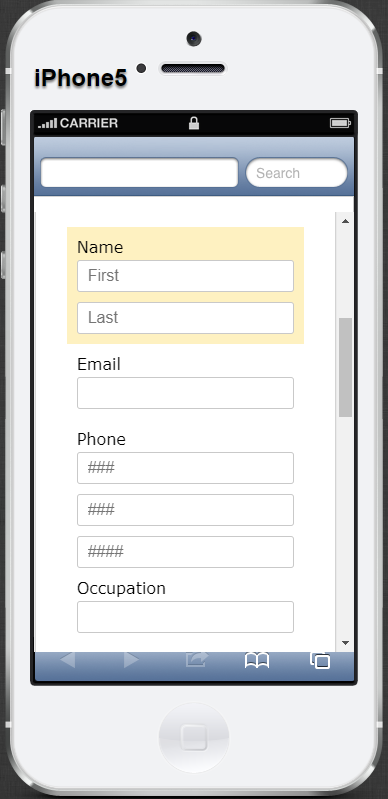
Chances are, you created your form using a laptop or desktop computer and it looks great. Have you made sure it looks good on phones and tablets too? Long forms can look even longer on mobile devices and can be less likely to hold the attention of on-the-go users.
12. Add a progress bar.
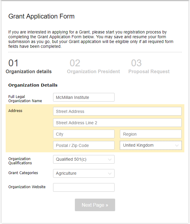
Your form is complex and long, despite your efforts to keep it simple. Break your form out into pages, which makes the task look a lot more manageable. Multi-page forms come with a progress bar, which assures users that the goal is in sight.
13. Include a freeform field
OK, this goes against our usual advice to remove all but the essential fields. Sometimes a user comes to your form wanting to communicate something that isn’t covered in the other fields. This is your chance to receive feedback and show that you want to hear from your users.
Your submit button is a great place to catch your user’s eye and remind them why they came in the first place. Use an eye-catching color, and forgo the default submit text for a benefit, e.g, “Reserve Your Spot,” “Apply Now,” “Get Information.”
15. Communicate submission success and show appreciation.
Once the Submit button is clicked and the submission delivered, show a customized Thank You message. It tells the user that the submission was sent successfully and thanks to them for their interest and effort. The Thank You page can also redirect users to your website. Customize this page in your Settings → Notifications section.
Looking for inspiration to find the best form submission Thank You message? No worries, we’ve got some ideas for you:
Inspiring Thank You messages your forms should have
While form filling is no fun, a few moments in the user’s shoes can help you design a web form that will be worth the user’s while.
UX Best Practices for Complex Forms – Infographic
It’s easy to get lost on the path to building a complex web form – but fortunately, there are landmarks along the way to help you find your final destination: the perfect form. Check out our infographic below and let us know what you think!

Load more...
