Shopping Cart Abandonment: Don’t Sweep This Issue under the Rug!
The thing with language (in this specific case, English) is that although personal abandonment issues and legal abandonment issues are very much different than shopping cart abandonment issues, they all root down to the same basic principle: the fear of being left behind.
Yes, believe it or not, your shopping cart has an innate fear of being left behind – of being played and then tossed, of being controlled and manipulated, only to be left hanging, with no resolution to its short-spanned life.
Your abandoned cart cries every time a user leaves before checking in the credit card details.
It’s a sad, sad situation – but fortunately, one you do have the power to put a stop to.
How?
How do you solve your online shopping cart eCommerce cart abandonment issues?
We have some tips for you – so keep reading and find out more.
What Is Shopping Cart Abandonment?
Let’s run a quick exercise: open a new tab in your favorite browser, go to Google, and search “abandonment issues.”
Chances are you’ll stumble upon a Search Engine Results Page that’s full of psychological insights into abandonment issues, the ways people develop these issues, and how to deal with them.
If you adventure yourself a bit further, there’s a pretty high likelihood that you’ll also find some legal definitions of abandonment.
You may or may not know what abandonment issues are all about in psychology and how it all connects to childhood traumatic events.
Moreover, you may or may not know what abandon is from a legal point of view.
In eCommerce, though, shopping cart abandonment is one of the saddest things that could ever happen to your business. Leaving all jokes aside, your cart may not cry when people leave the page without tending to its credit card needs – but you will definitely be pretty upset about it.
Research shows that the global shopping cart abandonment rate is of no less than 71%. On mobile phones, that’s even higher, up to more than 76%.
Shocked?
That’s a lot, sure. However, keep in mind that it would be unrealistic to think you can annihilate cart abandonment – just like it would be silly to expect every single person you have ever met and will ever meet to be there forever and ever.
That’s a utopia. Moreover, we all know just how wrong utopias can go.
Let’s come back to the primordial question of this entire section for a bit. Shopping cart abandonment refers to any eCommerce shopping checkout process that meets its bottleneck around the shopping cart moment.
In other words, if users leave your eShop before checking out the products in their cart, your shopping cart has abandonment issues.
The good news is that there are quite a lot of cart abandonment solutions you can do to drop that terrifying shopping abandonment rate. You do have to figure out what are your cart’s specific issues, though.
Which brings us to…
How to Understand Your Shopping Cart Abandonment Issues
You can’t know what a potential buyer is thinking – not when they are in a brick and mortar store, not when they are in an eCommerce store either.
You can only make an educated guess as to why they might want to buy your products (or why they might not want to do it).
Because we live in the Big Data era, you most likely have access to quite a lot of information about who your users are, how much time they spend on your site, and, most likely, how they convert into buyers as well.
The data is there – but don’t expect Analytics to give you plain insights. If you want to make the most out of all the information your site is collecting, you will have to put in some effort as well in your data management strategy.
The data interpretation is the very core of really digging out those shopping cart abandonment issues – just like therapy is in the case of human abandonment issues, for example.
Take your time; don’t rush. You wouldn’t rush if your friend came to you and told you about their problems and the things they have been keeping inside for maybe decades – so don’t rush with your data either.
The most precious nuggets of information and insights won’t come to you as such. They will dance around you, they will court you, and they will only open up to you when you start to listen genuinely.
The Most Common Shopping Cart Abandonment Issues
Just like lawyers were able to define and classify legal abandonment and just like psychologists were able to get down to the bottom of personal abandonment issues, digital marketers too have managed to identify some of the most popular problems with shopping carts as well.
Some of the most commonly encountered shopping cart abandonment issues include the following:
Signing up
Your shopping cart might have abandonment issues, but there’s a pretty good chance that users don’t want to commit to spending 10 minutes on a sign-up form that requires them to give their home phone number, work address, and the names of their childhood dream toys.
Ditch the compulsory sign up and provide people with a guest checkout option. It works. And no, you don’t have to let go of data collection and lead generation either.
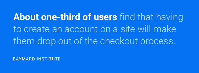
Image source:Baymard.com
Shipping Costs
People aren’t very keen on paying for the shipping costs – and even more so when those costs make the product seem a lot more expensive.
Try to find ways to offer free shipping, even if it’s for purchases above a specific limit. It is quite likely that users will want to buy more just to reach that free shipping threshold.
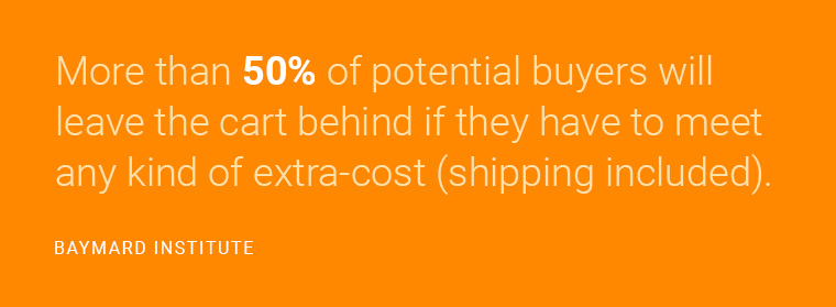
Image source:Baymard.com
Upsell and Cross-Sell
Now, we’re not saying you shouldn’t upsell, as this is one of the most common (and successful) ways to sell more to the same pool of users who travelled down your sales funnel.
However, don’t be too aggressive about it. People don’t like being sold to – much less so when they are already buying. Be subtle with your upselling and don’t try too hard because that might be the ultimate turn off for your potential buyers.

Image source:Conversionxl.com
Pricing
Everyone loves buying this for as little as possible. The thing with eCommerce is that it’s effortless for people to open another tab and search for the cheapest version of whatever it is they are looking for.
Don’t price your products too high, as compared to your competition. Also, do offer people to price-match whenever you can.
Also, adjust your prices to local currency – it’s pretty annoying to have to Google it so that you know how much you’re paying for a product.
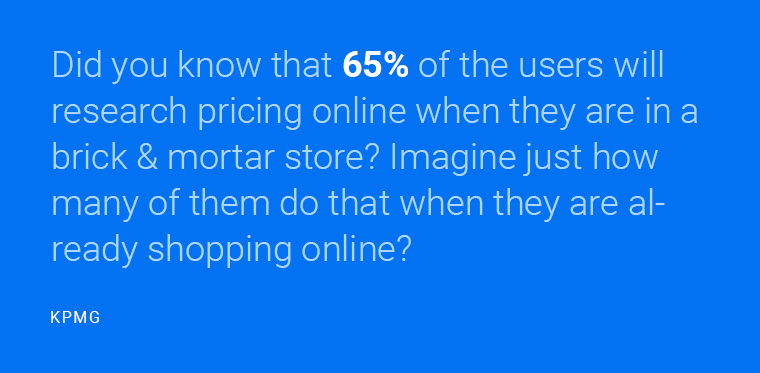
Image source:Assets.kpmg
Site failure
The entire user experience should be flawless from head to finish. By this tip, you should understand that you need a web design that will allow them to fly through your funnel smoothly. Everything needs to look excellent and appealing. Everything needs to move fast.
This is not optional. According to this case study, one in five customers will abandon their shopping cart if they find the page is too slow. Even more, a page that’s 2 seconds faster can convert up to 66% more.
Last, but not least, it is worth mentioning that more than 3 seconds of load time will make more than half of the users abandon their carts.
It would definitely help if you avoided all potential failures your checkout page might show. Not only makes it likely that the user will get distracted and leave the site, but it also makes you look less trustworthy.
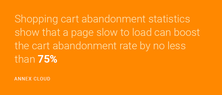
Image source:Annexcloud.com
Security
Speaking of trustworthiness, do make sure your checkout page is secure.
No, really, do that. You wouldn’t buy food from a restaurant that looks like it was cleaned in 2003, so why would you enter your credit card details on a site that seems shady and insecure?
Add a trustworthiness badge into the mix as well – it can work miracles. Norton Secured tends to work best according to statistics, followed by McAfee Secure, and TRUSTe.

Image source:Baymard.com
Payment Options
The more, the merrier.
People appreciate it when you provide them with multiple options for payment – precisely because they don’t like having to sign up for yet another payment processor when they want to buy something off a new site they haven’t tried before.

Image source:Comscore.com
Brick and mortar
Sometimes, people want to check out products, options, and specifications – and they want to check all of this online, where they have plenty of time to run analyses, and where they can read all the reviews in the world.
However, when it comes to the actual purchase, many of them will prefer the brick and mortar store, where they can see the product, touch it, and get a feeling of its quality. This situation might be true for large products (like refrigerators, for example), but it might as well be true for clothing, for example.
This issue is not abandonment per se – but you do have to encourage people to come to your store to get the product. That might not be entirely possible for shops that happen entirely online, but if you have physical stores too, definitely build campaigns around this type of encouragement.
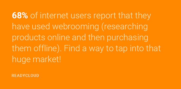
Image source:Readycloud.com
Return policy
“It’s complicated” is not the kind of relationship status you want your users to have with your return policy.
In fact, it might be a significant red flag for people who consider buying from you. The easier you make it for them to return a product, the more comfortable they will be with checking in those credit card details!

Image source:Walkersands.com
A complicated checkout
Again, “complicated” is generally not the right word – especially online, and especially in eCommerce. People buy online because it’s simple. If they have to run through a maze to give you their money, there’s something wrong with your checkout. Check it out and simplify it as much as you can.
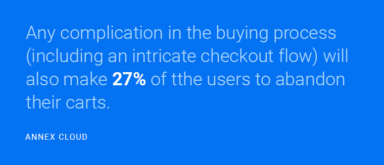
Image source:Annexcloud.com
Window shopping
Just like in real life, window shopping happens. Sometimes, people are not particularly keen on buying anything from your store.
They walk through it, and they might even add some stuff to the cart.
But when it comes to making a purchase, they click the little X button and fly off.
There are ways to convince some of these people as well. However, most of the time, it is what it is: window shopping. And you don’t have much to do about it.

Image source:Business2community.com
In a Nutshell: Fixing Shopping Cart Abandonment Issues
You can’t make people love your cart.
However, you can make them love the process – and thus, you can make them buy more.
In consequence, you can also drop that thriller-movie-worthy checkout abandonment rate.
In a nutshell:
- Keep it simple. Complicated is for the movies – in life and eCommerce alike. For the real-life folk out there, most things have to be simple. Shopping online makes no difference.
- Make it fast. If your site and if your checkout process isn’t fast, you probably need an upgrade. Slow-loading, complicated pages might’ve been all the rage in 1991, but these days, people want to move as fast as possible.
- Make it scarce. People are more likely to buy something if they see it running out of stock. A simple “Only 2 left” on the product page can speed up the entire checkout process on the end of the buyer.
- Make your cart stick. This tip taps back into the first point, where everything needs to be easy. Since many of your users might compare products on different sites, it’s a good idea to save their carts for a given amount of time – like 48 hours, for example. This will also give you a good opportunity to send out an abandoned checkout email.
- Be safe and secure. Nobody wants their credit card details stolen – and since eCommerce is already quite old at this point, most consumers are quite educated when it comes to this. Ergo, they will run like hell if they find anything even remotely suspicious about your site’s security or your trustworthiness as a business.
- Use remarketing. Google Ads, Facebook Ads, and shopping cart abandonment emails should be an eCommerce’s best friends when it comes to bringing back those who abandon their cart.
Studies show that a staggering $4.6 trillion worth of products are abandoned in the cart every year. Imagine tapping into that massive market of people who drop out of the checkout process! Even if you prevent only a small percentage of them from quitting your checkout, you are still making a lot of profit.
The average eCommerce checkout flow includes 23.48 form elements the user has to move through. The simpler you make it, the easier users are with their money.
Fortunately, shopping cart abandonment problems can be handled. You do need to tackle this with care and attention to detail – but it can be done. And boy, will your cart thank you for that!
Here are 4 shopping cart abandonment solutions that will amplify your success.
Load more...