Mobile Checkout Conversion Growth Tips
According to the latest studies, nearly 50% of the people on the internet (mind you, almost three billion of them!) use their phones to connect to the online world. That is a whole lot of online traffic! Without conversion (and, mind you, without retention), all traffic-bringing-efforts are just dust in the wind. Also, without hitting a proper mobile checkout conversion rate, you will miss out on reaping nearly half of what you sow.
The issue of increasing mobile checkout conversions is similar to that of a farmer who wants to make sure his grains are correctly prepped and harvested for maximum yield.
A good farmer knows the tricks that will make for a generous year. Sure, there are many factors the farmer may not be able to control. However, he can boost every seed’s chance to achieve its maximum potential.
A good eShop owner knows how to make sure site traffic doesn’t end up in the dumpster. For the eCommerce owner, every tiny bit of traffic should make a difference – not just in terms of site popularity with search engines and humans alike, but also in terms of actual cash flow.
The Quintessential eCommerce Checkout Flow | Best Practices
There is no set recipe on how to have a bumper crop. There are quite a few factors that come into play, and they all play into the end goal. As a farmer, all you can do is control the seeding conditions that might influence the growth of your grains.
The same can be done in eCommerce as well. Your relationships with your visitors are the seeds – and you must tend to their growth to see them transform into a successful crop. Moreover, yes, your eCommerce checkout plays a crucial role in this.
The best checkout UX is that which provides users with the best checkout experience – mobile or desktop.
The rules of building the best eCommerce checkout are not fixed, the same as there is no recipe for a successful harvest. There are high converting checkout pages and best practices you can employ and experiment with to get the best converting checkout pages. Here are some tips to keep in mind:
- Implement a sound guest checkout flow that doesn’t force users to create an account on your site. Yes, it is doable, and no, you don’t have to lose your connection to them. We have written an article about this right here, check it out and build an efficient guest checkout.
- Isolate your checkout area – it should provide users with no distractions whatsoever. The more distracted they are, the more likely it is that they will bounce off your checkout page to never return.
- Make the entire process crystal-clear. The user should know where they are in the process (e.g., Step 2/3). They should know the exact price they have to pay, and, of course, they should have an option on whether or not their data will be saved (and for what purposes in your data management strategy).
- Make it easy for them in terms of design. Long lists should come as a drop-down, for example. Moreover, whenever mandatory fields have to be filled in, mark them with an asterisk, as this is the commonly-accepted way to do it.
In general, the best checkout page designs and the best checkout flows do one thing very well: they make it extremely simple for people to spend money on that page. There are no bumps in the road, nothing people could get skeptical over, nothing that would turn them away from smashing that Place Order button.
Why?
Because in brick and mortar stores you are unlikely to sit in line for 5 minutes and not get through the process of payment. However, you are far more likely to do this when shopping online. Click-click and you’re done!
As an eShop owner, you rely on your entire site (checkout page included) to be a fun slide park for your customers. They get there, they quickly find what they want or need, and they proceed to checkout securely.
How to Skyrocket your Mobile Conversion Rate
If your desktop site has to be easy to navigate, your mobile site should be even more accessible.
Strip your mobile site down to the very basics. Strip it down to the required text, buttons, and colors, if that’s what it takes for your mobile pages to load faster and more efficiently.
Here’s an interesting fact: the more text, numbers, and images there are on your site, the more your conversion rate will drop – and the plunge is quite steep. As you move away from 400 on-page elements to 6,000, the probability you convert visitors into buyers drops by 95%.
Shocked? Don’t be. It’s a speedy world, and when you’re holding the entire power of three Pentium 4 computers in your pocket (literally!), you too expect things to move fast (and use as little data traffic as possible).
The rules of a great checkout page on desktop computers apply to the mobile checkout best practices as well. You still need to make it secure, you still need to make sure people know where exactly in the process they are, and you still need to make it simple. In fact, make it double-secure, double-clear, and double-simple.
Other than that, how do you get high mobile conversion rates in 2019? Here are some tips to keep in mind:
- Do make it even more visual. Since this is mobile and since things have to move faster, you should try to make your checkout page as visible as possible. Why? Because the human brain can process images more quickly than it does with text (fact!). So, add images and logos wherever you can: the payment processor options, credit card options, and delivery options.
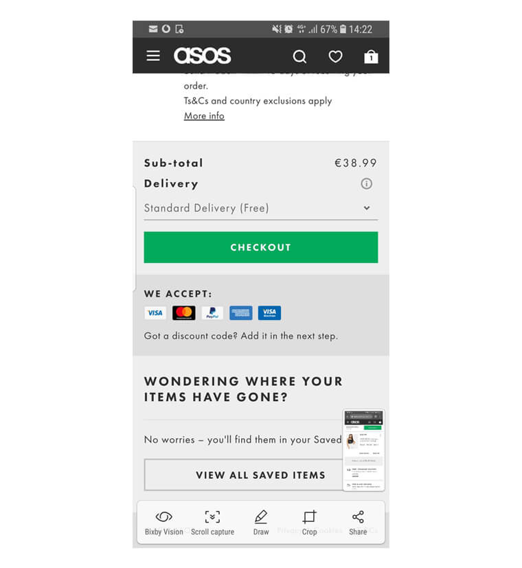
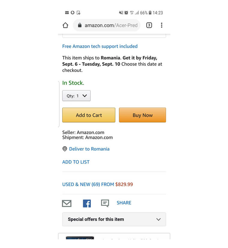
- Include one-click purchase options. This type of purchase is not just a way by which you remove impediments from your users’ race to purchase (and remove their potential second-thoughts too). It is also a great way to encourage people to sign up on your site (so that they can take one-click actions). It’s a win-win situation in every respect! Also, as a fun fact, Amazon has been doing it since 1999.
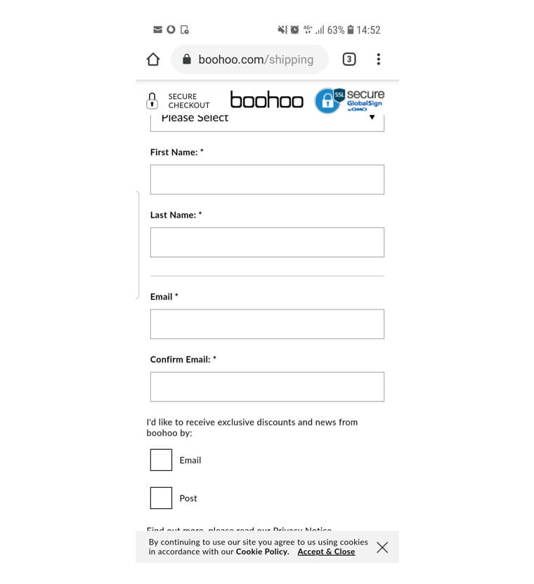
- Include trust marks. No need for lengthy and winding texts – as mentioned before, a badge will do. A “McAffee Secure” or a “TRUSTe Certified Privacy” badge can go a long way when it comes to making people feel safe on your site.
- Pop the pop-ups. They might be great in an extensive range of situations, but on mobile, they might simply block the view. Consequently, this means your mobile eCommerce conversion rate might drop dramatically.
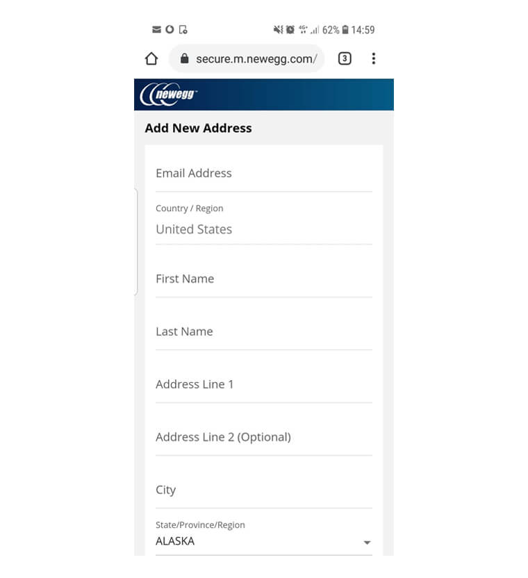
- Make sure your form is clean, comfortable to fill in (perhaps offer auto-fill options too), and most importantly, functional. Nothing annoys buyers as much as having to refill a form for the second, third, or fourth time!
- Include a quick order summary stage – just enough for users to know what they’ve ordered. This small step can improve your trustworthiness with them.
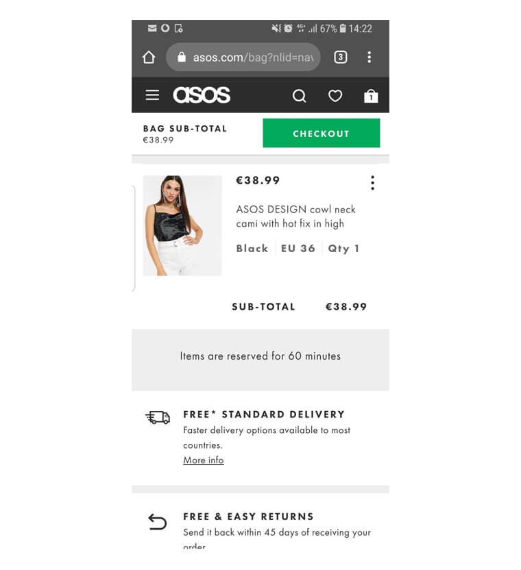
- Make it easy for people to use and fill a form with one hand. This is the dream when it comes to the eCommerce shopping experience, as having to use both hands can tend to come off as tedious and uncomfortable. Believe it or not, your mobile eCommerce conversion rate can end up depending on something as simple as this.
Of course, these are just some of the checkout UX best practices – the very basics. Every eShop is different, and, as such, every eShop will find different ways to convert their visitors into customers. Test out your hypotheses and see what works and what doesn’t – you might be surprised!
A Mindset Exercise: Be Like the Best Checkout Pages of 2019
You obviously want to increase your mobile conversion rate, especially with the massive pool of potential buyers scrolling down on their smartphones as we speak. Do keep in mind, however, that the average mobile conversion rate circles around the 2% mark for both Android and iOS (and is slightly higher on desktop). It is thus vital to keep your expectations realistic.
This is not bad news, though! If you attract 1,000 visitors to your eShop every day, if the average order value is, for example, $50, and you get a 2% conversion rate, that’s a total of $1,000 your business will cash in. The more people you attract and the more they order, the more your business will grow – but that conversion tipping point is absolutely crucial, because, unfortunately, clicks and time on a page don’t pay the bills.
On the other hand, there are more than 1.7 billion websites live, as of the beginning of September 2019. Out of these, only 110,000 are eCommerce websites that generate meaningful revenue.
At a global level, only a very handful excel at transforming their mobile checkout pages in mean, lean, conversion machines. That’s great news for you, though, mostly because:
- You do have great examples to learn from
- You now know there’s plenty of room on the market for you too
The examples we have included in the previous section come from some of the best checkout pages on the internet. It is not a guarantee that they will always stay the same – times, they are a-changin’ and, without doubt, the eCommerce checkout best practices will change again, and again, and then some more.
This continuous change is not there to keep you on your toes; it’s just how the world works. It all tends to be particularly true in the digital world, where everything can be turned upside down and inside out in a matter of hours.
There is no recipe for the best checkout of all times. Mostly, you can (and should) rely your choices on:
- Observations you make based on your experience
- Observations you make based on others’ expertise
- Studies and research papers you can read
- Professional advice from marketers, marketing blogs, etc.
- Some rules that stay more or less the same
Other than that, you might find that your pursuit of the best checkout design is not an overnight matter. It can very frequently be a trial and error matter. It can be a matter that requires excellent implementation.
Be realistic! You can definitely provide the best online checkout experience – but it takes testing, patience, and determination to get there, just like it takes months of care and attention to detail to see rapeseed blooming into those stunning yellow fields we see in May.
Nothing happens overnight. Mankind itself didn’t happen overnight. Agriculture doesn’t happen overnight. And, for certain, awesome conversion rates don’t happen overnight either!
Load more...