How to Reduce Online Form Abandonment and Increase Conversions
Online form abandonment can be frustrating, but it doesn’t necessarily have to become a problem for your business. Unfortunately, what this common issue can do is lead to lost sales and unsatisfied users. 123FormBuilder offers you some tips you can utilize to keep users engaged and increase your conversion rates.
By understanding why users abandon forms and implementing the best solutions to prevent that, you can improve the user experience and boost your online sales to complete success.
Minimize the number of required fields
One of the most efficient ways to reduce online form abandonment is to minimize the number of required fields. Only request the information that is necessary for your business needs. The more fields you require, the more time and effort it takes users to complete the form, which can lead to frustration and abandonment.
Additionally, consider using alternative methods for collecting information, such as dropdown menus or checkboxes, instead of requiring users to type out their responses. Simplify your form and minimize the required fields to increase users’ chances of completing and submitting it.
Provide helpful hints and guidance
Providing helpful hints and guidance throughout the form-filling process can also help reduce abandonment rates. For example, you can include tooltips or pop-ups that explain why certain information is required or how to format a response properly. Users are more likely to feel supported and motivated to complete the form when receiving guidance and feedback.
Simplify your form design
One of the main reasons for online form abandonment is a complicated or confusing design. To reduce this issue, simplify your form design by only asking for essential information and using clear and concise language.
Brand your 123 forms with your logo and colors to make them feel safer when giving out their data online. Make your form easy to understand and complete to increase the likelihood of users finishing and submitting it. Use visual cues like labels and placeholders to guide users through the form, and consider using a progress bar to show where they are in the process.
Test and optimize your forms regularly
Testing and optimizing your online forms is crucial to reducing abandonment rates and increasing conversions. Use A/B testing to compare different versions of your form and see which one performs better.
You can test various elements, such as the length of the form, the placement of fields, and the wording of instructions. With 123FormBuilder, you can easily do that and see which type of form is more successful with responders.
Additionally, regularly reviewing analytics data can help you identify areas of the form that users struggle with and make the necessary improvements. By continuously testing and optimizing your forms, you can ensure they are user-friendly and effectively convert visitors into customers.

New Insights to help you out on your form journey
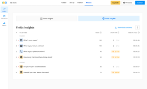
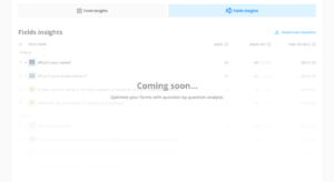
123FormBuilder is soon releasing new stats in the Insights section to help you determine the areas of the form that users struggle with. Get additional insights into responder behavior to better manage and optimize your 123 forms and get more successful submissions.
You will notice new stats in our Insights section. One is “Users,” which refers to the total number of survey participants who interacted with at least one form field. The second is “Abandons,” which shows the number of responders who interacted with at least one form field but abandoned the sheet before submitting it.

Embracing form abandonment and leveraging form insights has become paramount for your marketing efforts. Understanding why users leave forms unfinished empowers you to optimize your conversion strategies and deliver a more seamless user experience. By harnessing these insights, you can drive higher conversions, nurture leads effectively, and ultimately achieve your goals!
Load more...
