The Guest Checkout Saga: Will It Make or Break Your eShop?
Welcome to Fast’n’Easy, where instant gratification comes at the push of a button and happiness is delivered by your friendly local FedEx, every day, from 9 to 5!
In the Fast’n’Easy world, it is understandable why guest checkout use seems to be on the rise. It makes sense: the easiest way to place an order and escape any lengthy forms and formalities is to opt-out. To be a guest. To be the (not so) anonymous user who does not want to be bothered with further questions, quizzes, and super-discounts on Black Friday.
Guest checkout sites rely on their customers’ appetite for ease of post-order anonymity. For customers, checkout as a guest offers what they want. It provides them with an easy way of gaining (almost) instant gratification and satisfaction without bothering with any commitment.
How great an idea is a guest user checkout for you, as an eCommerce store owner, and how much should you rely on it?
We plan on tackling this subject in the article ahead – so read on if you want to find out more.
What Is Guest Checkout in eCommerce?
When she was a kid, one of my college classmates wanted one thing and one thing only: to be a guest. When asked what she wanted to become when she grew up, she bolted out the same naive answer every time: I want to be a guest! To her, visiting other people’s houses and getting all the attention was the best thing ever. The best!
Needless to say, as she moved into adulthood, she learned that being a guest doesn’t pay the bills. Plus, as you’d imagine, hosts started treating her with a little less interest than when she was a kid. Her curly hair stayed the same, but it became increasingly awkward for people to pinch her cheeks when she became a fully-grown young lady.
It is quite easy to understand why she loved being a guest. She could bathe in the luxury of being a guest with none of the responsibilities she associated with back home. She was free to be showered with joy and candy without much after-thought!
The lack of after-thought is precisely why guest checkouts work. It is also why more and more eCommerce sites choose to include it as part of their strategy. When they can opt for guest checkout, people will do it because it’s faster and easier. They will do it because it helps them avoid filling in long, endless pages of personal contact information.
So, what does guest checkout mean, more precisely?
In short, a guest checkout allows your customers to tacitly and subtly leave your house without leaving their contact details. This means you won’t be able to contact them in the future when running a particular campaign or when you start selling products that might interest them.
Guest checkout websites will only collect the absolute minimum amount of information about their customers: name, surname, email, and delivery address. However, once the product is delivered, none of this data should be stored (unless the customer agrees to it).
You’d think that this is the perfect guest checkout GDPR move – and it is, from many points of view. Beyond that, deciding whether guest checkouts are either good or bad for business lies between settling on:
- a potentially higher guest checkout conversion rate or
- a potentially lower guest checkout retention rate.
The great news is that things don’t have to be this way. Your guest checkouts don’t have to be your customers’ invitation to ghosting you out of their lives. The secret lies in how you build your guest checkout page.
Guest Checkout Best Practices
A guest checkout button can work wonders on your conversion rate. Research shows that the average cart abandonment rate is of 65.23%. Moreover, only 11% of the users complete the checkout process. What may be more revealing for the overall topic is that 14% of the users who abandon their carts do it because they have no guest checkout examples.
There is a direct correlation between guest checkouts and conversion rates. Whether customers choose to register or pick the guest checkout option, you still want to stay in touch with them. When they register, this is easy – you get to keep their email and let them know about it. When they don’t, however, your options will be more limited.
Fortunately, there are strategies you can use to bypass your customers’ unwillingness toward filling out three whole pages of forms and questions. Your very best bet is asking the customer if they would like to save their details for their next purchase. However, even when you do this, you should still keep in mind the essential guest checkout best practices. Some of the most important ones include the following:
- It doesn’t matter how many amazing stories you want to share with your customers. Keep your guest checkout short and sweet, no more than one page. That is, in the end, its primary purpose no matter how many guest checkout redesign attempts it goes through.
- Your guest checkout UX needs to create a seamless experience for every user on your site. Tell your customers from the very beginning that they can either register or proceed with the guest checkout.
- If you don’t care that much about user registration (and why would you, if you can collect information in other ways?), make guest checkout the default option. This will make things even easier for your customers.
- Always leave the door open. Even if someone has already registered on your site, you should still allow users to take the guest checkout route whenever they want to. This tactic could prove useful in various circumstances – such as when someone wants to surprise their spouse with a gift, but they share the same account on that specific eCommerce website.
- Whatever you do, your checkout must be secure. These days, most customers will associate a shady checkout page with major red flags. Sure, the lack of a guest checkout might turn them away from making the purchase. However, you can bet your money that an insecure checkout of any kind will turn them away.
- Avoid site bugs like the plague. If your checkout process is interrupted by a technical issue, this is a nearly surefire way to lose a customer. Not only does this make them trust your site less, but it will also annoy them to have to fill in the same details again.
- Tone down your call-to-action buttons. You don’t need multiple call-to-action buttons right next to each other – one is enough. Remember when shadier websites used to have at least five call-to-action buttons, and only one of them was real (usually, the least appealing one)? Those days are long gone. Believe it or not, the cute button is the right one these days!
- If you allow guests to enter any discount codes, let them do it early in the process. Otherwise, they might perceive it as a way for you to trick them.
- There is a time for everything, but this is not the time for upsells. As mentioned before, your entire guest checkout process has to be as simple and straightforward as humanly possible.
- Display their progress. Even if your guest checkout form is only one page long (which it should be!), your customers have to know where in the process they are. The progress bar gives them peace of mind, and it shows that you have no hidden motif.
In general, the main rule of thumb is this: think of your behavior as an eCommerce customer. Would you like being asked a thousand questions while you are trying to check out a product? Would you like being interrupted? Not knowing what button to click? Not knowing exactly where to look? Probably not. So, it is more than likely that your customers won’t like it either.
Guest Checkout Examples
We could write entire anthologies on the do’s and don’ts of guest checkout pages. For this article, we will only show you a couple of guest checkout examples (both positive and negative).
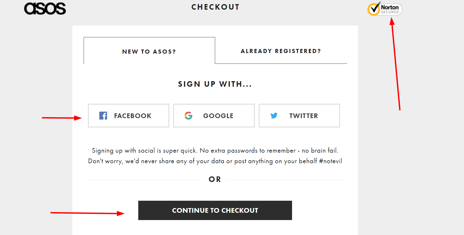
ASOS is one of the most popular eCommerce websites in the world – there’s little you can say to debate that. What you may not realize yet is that part of ASOS’s success lies in the way their site treats the customers’ journey.
ASOS’s guest checkout is part of their success as well. As Paul Rouke shows in his article about ASOS’s guest checkout, there are several areas where ASOS is an undeniable checkout game champion. Some of the qualities behind their guest checkout include the following:
- Their security symbol is enhanced, which makes people trust the site more
- The customer’s progress to thoroughly checking out is clear
- You have the option of entering the address manually as well
- You can review your order before placing it
- You won’t lose information if you click back

There is much more to ASOS’s guest checkout and registration process – some of it is great, other parts leave room for improvement. But, overall, their checkout page is a great example – maybe even one of the best checkout UX examples of 2019.
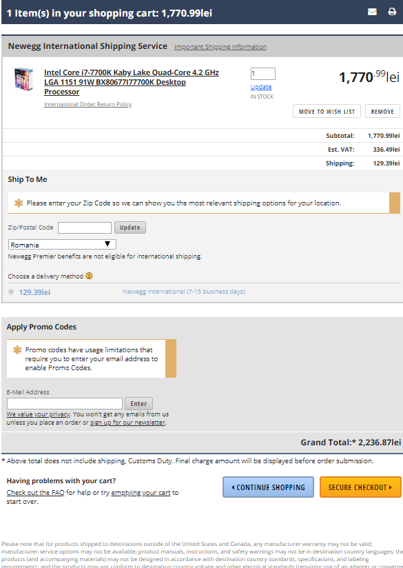
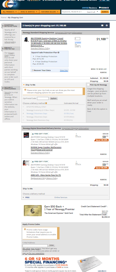
On the other hand, there are plenty of checkout examples that we should take as negative examples. For instance, Newegg’s checkout page is quite confusing. In theory, they nailed a couple of markers of a great checkout page: all the information is on one page, promo codes can be added early in the process.
In practice, however, the site looks slightly confusing when you order a single product (see screenshot below).

If you order products that include gifts, the checkout page will become instantly more baffling, as it shows in the screenshot below.

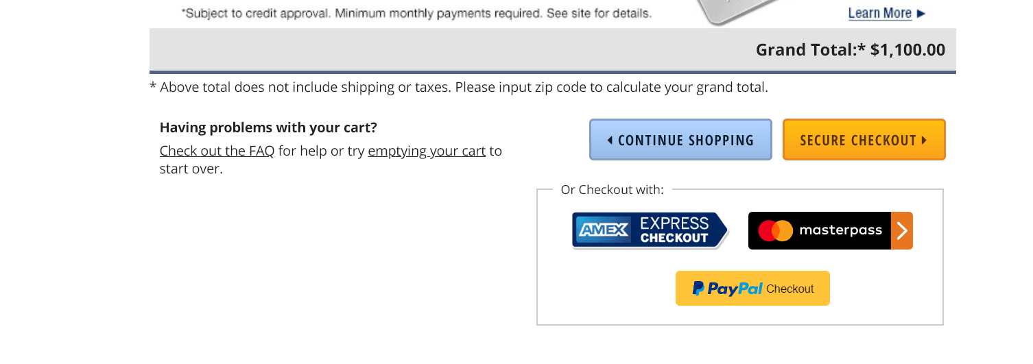
Things get even more baffling when you try to move to the next stage as well. The first instinct is to click on “Secure Checkout,” as it is the first button you see. This action will lead you to a page where you are asked to either sign in or sign up. At this point, new users will likely drop out of the buying process.
There is some form of guest checkout (albeit not a “fully-fledged” one) if you choose to checkout with one of the three options (PayPal, American Express, or Masterpass). However, these options will only lead the customer off-site through a pop-up, and they will not provide the customer with the last chance to “save their details for the next purchase.” This decision is very likely to drop the checkout conversion rate, as well as the retention rate.

Of course, there are other examples as well – but those shown here are meant to help you understand how excellent and lousy guest user checkout pages look like. Each site, business, and target audience is different – so it is crucial that you adapt your checkout page to all of these verticals. The purpose is to ensure that both conversion and retention rates are as high as possible.
Guest Checkout vs. Customer Accounts
So, after this long journey into the guest checkout saga, is it a “yes,” or is it a “no”?
Well, yes! eCommerce checkout as a guest is the least restraining and least time-consuming way of making a purchase online. It makes all the sense in the world to offer this option to your customers, as it will invariably boost the checkout page conversion rate.
As emphasized throughout this entire piece, it is essential that your guest checkout website page is created correctly, keeping checkout conversion rate, retention rate, and overall UX rules in mind.
What would we bet our money on?
Guest checkouts! However, we will tackle the subject of how guest checkouts compare to actual customer accounts in a future article – one that, hopefully, will help you make the right decision for your particular case.
How to implement a proper guest checkout?
You can use 123FormBuilder. Creating forms with our tool is extremely easy; there’s no coding needed. Plus, we offer an extensive range of payment integration options – so you can rest assured that you can seamlessly connect our form builder with your preferred payment options.
Other than the form itself, keep in mind the essential tips pointed out throughout this article – but most importantly, keep your user in mind. When you build a painless process for your users, they will smoothly flow through your sales funnel and become customers. Even more, they will become loyal customers, and some of them will become evangelists too!
The devil is in the details, they say. When you’re fighting a world of eCommerce competitors, you want to be ahead of your game when it comes to just how much attention you put into every teeny, tiny element on your checkout pages.
Guests rule the world of eCommerce precisely because the very concept of being a “guest” in a digital store is tightly connected to the essence of the internet itself: speed and ease of use.
Thinking back, my friend might have made a mistake when she chose not to become a professional guest when she grows up – looking at GDPR, data scandals, and the way UX has changed over the course of the past decade, it seems that guests do make the world (wide web) go round!
Load more...