Checkout Process Optimization: Top 3 Misconceptions to Avoid
Does your shopping cart have abandonment issues? Of course, it does. They all do. So, before we get started, consider this: your checkout process will quite probably never deliver 100% favorable conversion rates in any consistent manner. One may even argue that it is purely impossible. In fact, the average online shopping cart abandonment rate hovers around the 70% mark. Simply put, seven out of ten users that make it to the checkout page will abandon the purchase.
Nonetheless, your conversion stats on this crucial last stage of your sales funnel can and, with the appropriate effort, will get better and better. And better. Keep in mind that the checkout process is all about collecting customer data (and managing the data) while offering a high level of trust. Our form builder focuses on the challenges of gathering useful data, so we know a thing or two about it.
There are tons of articles out there that show precisely how to experiment toward optimizing your checkout page for higher conversion rates. These articles touch upon a large variety of checkout-related concepts and tactics from UX, loyalty program campaigns, and checkout flows to shopping cart development, predictive analytics, and constant A/B testing. I will even link to a couple of the most comprehensive articles covering the topic of checkout process optimization.
As for the page you are currently on, what you are about to read is meant to assist you in steering your online-shop development efforts away from the main pitfalls of checkout-optimization myths, and into the light of data-driven eCommerce. So, without any further delay, here are the most critical three misconceptions about the checkout process that eCommerce shops must avoid:
Checkout Process Optimization Myth #1 | The Shopper Forgot about the Shopping Cart
Yep, it’s either that or the Juju Monster must have scared the customer away. The numbers are precise regarding the actual reasons why people abandon the checkout process. There is still room for debate, of course, but, to sketch a set of best practices, we must steer away from exceptions and build on a stable, data-driven position.
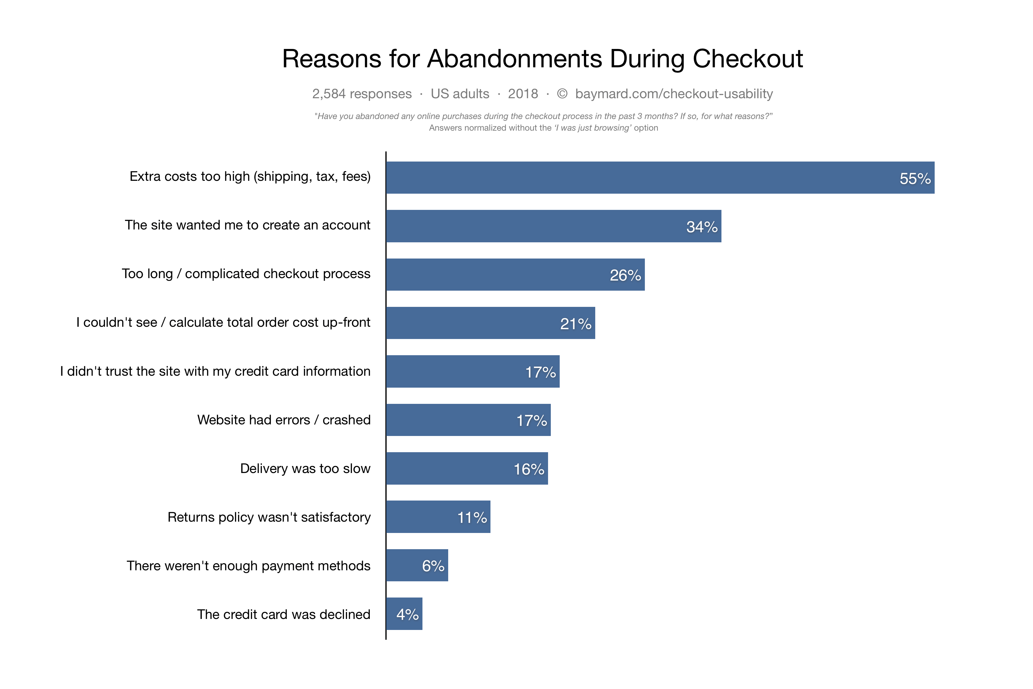
An independent Baymard quantitative study shows that more than half of the 2584 respondents list “high extra costs” as the main reason for shopping cart abandonment during the checkout process.

From these stats alone, we can derive ten incredibly useful tips you can use to inform your checkout process optimization. Let’s get through them together:
- Be fully transparent and tell your users upfront about your shipping costs, taxes, and virtually every extra cost associated with completing a purchase on your e-shop.
- Allow your shoppers to complete purchases without having to create an account on your website. Here is an informative and surprisingly entertaining article my colleague, Octavia, has just published on the 123FormBuilder blog on the topic of guest-checkout best practices. Enjoy!
- Streamline your checkout process. There are several ways to do so, and we will dive into the topic in a future blog post. Until then, I will leave you with WooCommerce Brenda’s (yes, just Brenda) wonderful article on the matter. It will fill you in on the basics: 6 Ways to Streamline Your Online Store’s Checkout Process.
- Clearly list the costs of every purchased article and the total order cost on the final checkout page. Your users cannot be expected to offer credit card details unless you are telling them precisely how much you are going to charge them. Fair enough?
- Offer your customers reassurance regarding the safety of the transaction. An SSL certificate goes a long way in establishing trust, but you can also consider adding an extra layer of reassurance through the introduction of a “Norton Secured” or “Google Trusted Store” badge. Baymard’s 2016 eCommerce UX study shows that these two badges are most likely to bring the extra peace of mind that will determine the customer to smash the “Complete Purchase” call to action (CTA).
- Clean up your website. No bugs, no crashes, no errors. Would you trust a website with your bank card data, if the site cannot be trusted with its content and flows?
- Make sure you can offer the best delivery times possible, within the limits of your buyer persona’s budget. Finding the right delivery services can be a delicate balance act, but a bit of persistence and a whole lot of negotiation with the delivery companies can bring your checkout abandonment rates lower and lower. And lower.
- Make your privacy policy, terms & conditions, and, most importantly, your returns and refunds policy transparent, reasonably customer-centric, and readily available on the website, at every stage of the checkout process. This small yet consistent detail will bring the added benefit of lowering your chargeback rates. This, in turn, will make you the sweetheart of the payment processing service providers, which brings us to our next point:
- Offer your customers a wide variety of payment methods. First of all, thoroughly research the markets you are selling in. The preferred payment methods in California might be quite different from those in New York or… Romania.
- Sometimes your customer’s credit card gets declined. Make alternative payment methods readily available to the customers and offer them actionable paths to return to their shopping carts, if none of the alternative payment methods suit them. Emails, push notifications and cookie-guided remarketing campaigns go a long way.
How is that for actionable insight?!
Checkout Process Optimization Myth #2 | It Is Difficult and Expensive!
Well, to be entirely open about it, checkout optimization is neither completely easy nor totally free. Every data-driven decision-making endeavor and its consequent developments entail a range of tactics and operations that require some level of expertise and investment.
Now, that we’ve stated the obvious, let’s clear up the air once and for all: you do not need an academic degree in conversion rate optimization (CRO) or a six-figure quarterly budget to optimize your checkout process for better conversion rates.
As mentioned, there are a lot of articles out there covering the topic, and you will be able to find an impressively large amount of tactics and tools. For example, this BigCommerce blog post covers 33 eCommerce CRO steps that have a high chance of bringing you better sales stats.
However, most of the tactics listed there and within similar articles are entirely useless, unless you set up your website for checkout optimization from the get-go.
Here are four essential aspects to consider when setting up your website as the conversion machine it needs to be to achieve eCommerce level 99 awesomeness:
- Use a dependable, robust, scalable, and flexible CMS or eCommerce platform. I am not in the position to suggest such a solution, but I can certainly state that it all depends on how tech-savvy you are. For most eCommerce endeavors, Wix, WooCommerce, Shopify or any of the other click-ready solutions out there are more than enough for most users. These solutions offer useful analytics and A/B testing functionalities out-of-the-box.
- Use a dependable, robust, scalable, and flexible form builder. This is where I tell you that there is no form builder like 123FormBuilder. Well, there truly isn’t, but don’t take my word for it. Check out a few of the 4175 user reviews on the Wix app market. Even after 2.78 Million app downloads, we rank first among form solutions with an almost perfect 5/5 stars score. A huge shout out to our user base!
- Use dependable, robust, scalable, and flexible analytics, A/B testing and reporting tools. Google offers several analytics solutions, but here are three other tools you might want to check out: Ahrefs, A/B Tasty, Crazy Egg. In due course, you and the involved members of your team will need to make the decision, but I believe this narrowed down your search. Perhaps too much so. Here is a somewhat wider list of conversion optimization tools compiled by iMpact.
- Choose your payment service provider carefully. The range of payment methods provided impacts your checkout performance levels tremendously. Do I need to mention that 123FormBuilder offers a variety of payment service integrations out-of-the-box? And yes, the list includes PayPal and Stripe.
Summing up, the checkout process is not that difficult, once you set everything up correctly and put the work in. You CAN do it yourself. As to how much it costs, you can surely start small and invest more once it makes sense to do so. It is rather affordable, to begin with.
Checkout Process Optimization Myth #3 | Checkout Optimization Is all about A/B Testing
Before going through the maddening process of A/B testing the color and shape of that CTA button on the checkout page, there are many, many things you can do concerning checkout optimization. Sure, they say that every pixel on the checkout page needs to be optimized for conversion, and guess what? I agree!
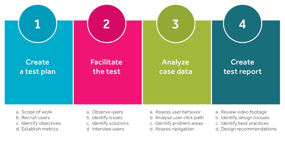
However, customarily, a basic usability test will bring forth plenty of minute user-interaction friction points and bottlenecks, preventing customers from completing a purchase on your website. Here is a quick four-step guide to usability testing provided by uxdesign.cc:

Additionally, I’ve found out that Hot Jar heat maps are massively useful tools in identifying even the minutest of UX roadblocks. Nonetheless, I want to leave you with a few principles that will inform your decisions in the areas of usability testing and checkout CRO. It is called the Think Aloud Protocol, and I encourage you to further look into the concept.
All in all, basically applying the Think Aloud Protocol, here are the questions you need to answer about your checkout process:
- Is your checkout process functional? Make sure that the site and the checkout flow reflects why and for whom it has been created. Is it obvious? If not, make it obvious. Idiot-proof it.
- Is your checkout process accessible? Moreover, how quickly can a user get to and through the checkout process? Not too quickly? Make it fast. Tesla-ludicrous-mode fast.
- Is the checkout process usable? Are your messages concise and easy to read? Are your navigation items easily identifiable as navigations items?
- Is your checkout process intuitive? How user-friendly is your checkout process, really? Are you trying to contort your users’ habits, just to fit your UI idiosyncrasies? Just stop!
- Is your checkout process persuasive? Hey, I wouldn’t want to transform this into a marketing lesson, but remember to sell an experience, not just a set of products. Also, leverage testimonials, create urgency, and test out the myriad of sales techniques that have been bringing profits to established retail brands for decades and decades. Some will do wonders for you as well, I bet.
After going through these steps, of course, you can pursue A/B testing. In fact, periodical usability tests will adequately inform most of your A/B testing endeavors.
Let’s Wrap Up!
Online shopping is an incredibly convenient addition to our modern lives, and it has been both the object and the main driver of innovation across several fields, both on and off-line. However, you don’t need to start innovating right away to make it in this crowded, yet highly profitable field.
Build a balanced, well-thought-out technology stack, avoid the common pitfalls that trouble most of your competitors, and pursue your customers within the niche you have chosen with the tools and tactics readily available to you. This alone will keep you ahead of the competition, in most cases.
There will be plenty of time to innovate and disrupt further down the line. It might sound like an overly conservative perspective, but all I am saying is that you don’t need to risk by investing too much right away. There is no growth like organic growth. Do you agree?
Load more...